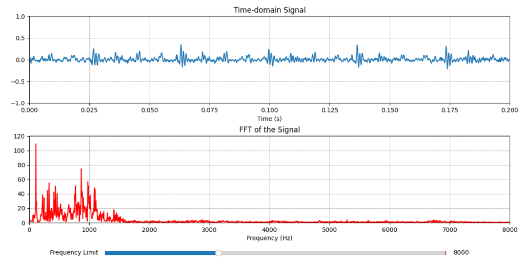
Task: Real-time plotting of the PC’s audio input signal.
Scenario: Use the sounddevice library to capture the audio signal from the PC to plot in real time the time domain (waveform) and its respective FFT.
📥 Dependency: pip install matplotlib sounddevice numpy
Python
import matplotlib.pyplot as plt
from matplotlib.animation import FuncAnimation
from matplotlib.widgets import Slider
import numpy as np
import sounddevice as sd
import sys, queue

# Parameters for the audio signal stream
SAMPLERATE = 44100
WINDOW = 200

# Audio buffer setup
mapping = [0]
q = queue.Queue()
length = int(WINDOW * SAMPLERATE/1000)
ydata_time = np.zeros((length, 1))

# This is called (from a separate thread) for each audio block
def audio_callback(indata, frames, time, status):
    if status:
        print(status, file=sys.stderr)
    q.put(indata[::1, mapping])

# This is called by matplotlib for each plot update
def update_plot(frame):
    global ydata_time
    # Update y data with new audio chunk
    while True:
        try:
            data = q.get_nowait()
        except queue.Empty:
            break
        shift = len(data)
        ydata_time = np.roll(ydata_time, -shift, axis=0)
        ydata_time[-shift:, :] = data

    # Update time-domain plot
    for column, line in enumerate(lines_time):
        line.set_ydata(ydata_time[:, column])

    # Compute FFT for the last chunk of data
    fft_data = np.fft.fft(ydata_time[:, 0])
    fft_data = np.abs(fft_data[:len(fft_data)//2])
    ydata_freq = np.fft.fftfreq(len(ydata_time), 1/SAMPLERATE)[:len(fft_data)]

    # Update the frequency-domain plot
    lines_freq.set_data(ydata_freq, fft_data)
    ax2.set_ylim(0, np.max(fft_data) * 1.1)

    return lines_time + [lines_freq]

# Slider callback
def update_xlim(val):
    ax2.set_xlim(0, slider.val)
    plt.draw()

# Create a figure and axis for the plot
fig, (ax1, ax2) = plt.subplots(2, 1, figsize=(12, 6))

# Time-domain plot
ax1.set_title('Time-domain Signal')
ax1.set_xlabel('Time (s)')
time_axis = np.linspace(0, length/SAMPLERATE, length)
lines_time = ax1.plot(time_axis, ydata_time)
# ax1.set_yticks([0])
ax1.axis((0, time_axis[-1], -1, 1))
ax1.grid(color='gray', linestyle='--', linewidth=0.5)

# Frequency-domain plot (FFT)
ax2.set_title('FFT of the Signal')
ax2.set_xlabel('Frequency (Hz)')
lines_freq, = ax2.plot([], [], 'r')
ax2.set_xlim(0, SAMPLERATE//2)
ax2.grid(color='gray', linestyle='--', linewidth=0.5)

# Layout adjustment
fig.tight_layout()
fig.subplots_adjust(bottom=0.15)

# Add a slider for controlling the xlimit of the frequency-domain plot
slider_ax = plt.axes([0.2, 0.02, 0.65, 0.03])
slider = Slider(slider_ax, 'Frequency Limit', valmin=1000, valmax=SAMPLERATE//2, valinit=SAMPLERATE//2, valstep=100)
slider.on_changed(update_xlim)


# Audio Stream and Plot Animation - device = None: Default
stream = sd.InputStream(device=None, channels=1, samplerate=SAMPLERATE, callback=audio_callback)
ani = FuncAnimation(fig, update_plot, interval=30, blit=True)

with stream:
    plt.show()
Note:
- The example uses the Python
sounddevicelibrary to record audio in real-time. Make sure your microphone is active and configured correctly.
Matplotlib
Matplotlib is a powerful, flexible Python library used for creating a wide range of static, animated, and interactive visualizations in Python. It is especially popular in data analysis, scientific computing, and machine learning fields for creating plots and graphs to visualize data insights.
Key Features:
- Versatile Plotting: Matplotlib can create a variety of 2D plots, including line plots, scatter plots, bar charts, histograms, pie charts, error bars, and more.
- Fine Control: It offers a high level of customization, allowing control over almost every aspect of a plot (colors, line styles, fonts, labels, grids, etc.).
- Multiple Backends: It supports multiple output formats, such as PNG, PDF, and SVG, and can work in different environments, including Jupyter notebooks, web applications, and desktop applications.
- Object-Oriented API: Matplotlib offers both a high-level
pyplotinterface, similar to MATLAB, and a more advanced, object-oriented approach for more complex plots. - Interactive Features: It allows users to create interactive plots (e.g., zooming, panning) when used in combination with libraries like
IPythonorJupyter Notebooks.
Common Use Cases:
- Data Exploration: Visualizing data distributions, trends, and patterns using line plots, histograms, and scatter plots.
- Reporting: Creating publication-quality static graphs for reports and papers.
- Data Science & Machine Learning: Visualizing model performance, confusion matrices, and feature importance.
- Customization for Dashboards: Embedding detailed plots into web-based dashboards.